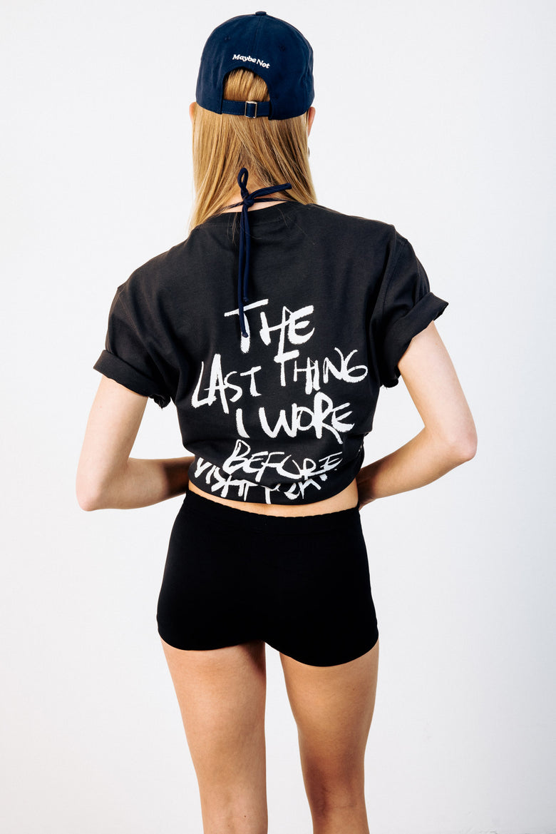


How Much Logo Is Too Much? Setting the Branding Level in a Streetwear Outfit
Nobody counts how many times a brand repeats across an outfit, yet that number decides what the outfit ends up saying. On the three levels of visibility, the one-loud-piece rule, and the colour choices that quietly enlarge a logo.
There's a check almost nobody runs before leaving the house: how many times does a brand name or emblem repeat on you right now? The answer usually comes in higher than expected. A print on the chest, an embroidery on the cap, a stripe on the sock cuff, a letter on the bag hardware. Individually none of it is much. Added up, it changes the tone of the whole outfit.
Streetwear's relationship with the logo has never settled. For a stretch the emblem was expected to be as large as possible; then the prized thing became a piece you could only identify by its stitching. Both are current at the same time now, which means the useful question isn't which one is correct. It's how you dose the two within a single outfit.
Three levels of visibility
One simple distinction does most of the work here. Every piece on you sits at one of three levels.
Quiet covers anything unreadable from two metres away: a small print at pocket height, a label-sized embroidery, a plain collar. Mid is what registers without shouting: a normally proportioned emblem sitting centre chest, the logo on the front of a cap. Loud is the first thing read from a distance — a print running across the back, oversized type, a large graphic in a contrasting colour.
The practical benefit is that you stop counting how many pieces you're wearing and start counting how many sit at each level.
One loud piece, everything else below it
There's really only one rule worth keeping, and it's blunt: let a single piece occupy the loud level.
If you've put on a tee carrying a wide print across the back, the outfit has already said its piece for the day. Something like a back-printed tee stands on its own; adding a second assertive graphic beside it weakens both. The reverse holds too — when everything is at the quiet level the result tends to read flat, and a single mid-level piece is usually enough to fix it.
Which is why a wardrobe works better when the graphic-led tees sit alongside neutral tops that can go under them on the same day.
A small logo is doing a different job
Mistaking the quiet level for "no logo" is a common slip. A small emblem is doing something specific: leaving a reference in the outfit without pulling focus onto it.
Tees with a small print at pocket height are the clearest example. Worn alone it's a plain tee; worn under a layer it becomes a detail visible at the neckline. Socks with a thin logo on the cuff and small objects like keyrings and card holders do the same job. None of them is the sentence — they're punctuation.
A cap adds one to the count
Caps get left out of the tally more often than anything else, which is odd given where they sit. Because it's at face height, the emblem on the front of a cap almost always counts as mid level, and it's usually the first logo anyone actually reads.
The takeaway is straightforward: on a day with an assertive graphic up top, drop the cap a level. Neutral tones like camel with a single embroidered letter fit exactly that gap. On a day with no graphic at all, the cap can be the only signature in the outfit.
Colour enlarges or shrinks a logo
A print of a given size takes on a completely different volume depending on how it contrasts with the fabric under it. A black emblem on white reads several times larger than the same emblem in grey on grey.
So when you're adjusting the dose, look at contrast before size. A dark print on a light ground carries a daytime outfit on its own, while a tonal print leaves room for another detail next to it. Graphics sitting in the same tone as a black ground always read a level quieter than they measure.
The option of no logo at all
Building an outfit with no emblem anywhere is perfectly valid — it just hands the job over to cut and cloth. Wash tone, shoulder width and weight move to the front.
Pieces like a washed grey sweatshirt exist for precisely that: nothing to read, character coming entirely from how the fabric sits. A wardrobe built out of core pieces stays flexible for the same reason, going under a graphic tee and a plain sweatshirt alike. It's also why a portion of the sweatshirt and hoodie shelf is deliberately kept at the quiet level.
It comes down to a counting habit
None of this needs a rulebook. A one-second check before you head out does it: how many places is the brand visible, and how many of those are readable from across the street? If the count is above two and both are loud, pulling one of them down a level fixes the outfit almost every time.
In Nişantaşı or anywhere else, that flexibility is what makes streetwear comfortable in the first place. The same wardrobe can produce an outfit that says nothing on one day and everything in a single line on the next.

