

Print, Embroidery and Knitted Motifs in Streetwear: Why the Same Graphic Never Reads the Same
The same logo is printed onto a tee, stitched into a cap and knitted straight into a sweater — and each method turns it into a different garment. A look at flat print, raised ink, embroidery, knitted motifs and garment washing: what each one is good for, and how to tell them apart with your hands on the rail.
Turn a t-shirt inside out. What sits behind the graphic on the chest tells you more about how the piece was made than the care label ever will. A print leaves a thin film on the reverse; embroidery leaves thread knots and usually a backing; a motif knitted into the garment leaves the negative of its own colour. All three methods can carry the same artwork — and all three turn it into a different object, on the hanger, on the body, and after twenty washes.
Streetwear rarely talks about this choice. Yet it quietly decides most of the price gap between two otherwise identical pieces, the weight you feel in your hand, and what the thing looks like a season later.
Flat print: fastest, sharpest, most fragile
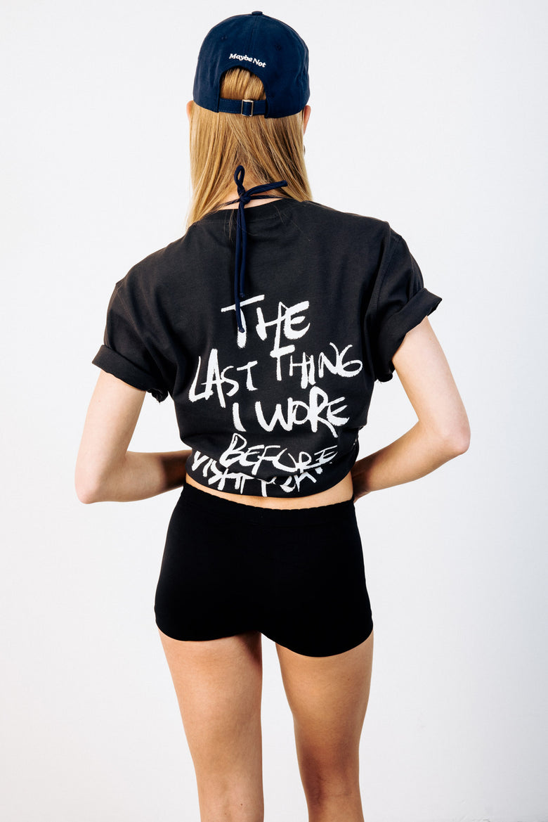
Screen printing and its relatives lay the graphic on top of the fabric as a layer. The upside is obvious — fine lines survive, gradients hold, typography arrives exactly as it was drawn. If a garment has to carry a sentence or a detailed illustration, this is the honest way to do it.
The fragility comes from the same place. The print does not move with the cloth, it sits on it, so the first years can bring slight cracking, a loss of sheen, or thinning at the edges. Most of that is in the wearer's hands: washing inside out and keeping the iron off the graphic extends its life dramatically.
The cleanest version of this in store is the signature logo printed on black. When the artwork shrinks to a single mark at chest height — as on the grey pocket logo tee — the print works even less hard, because a smaller area is exposed to the way jersey stretches.
When the ink gets thick
Some prints don't stay flat. Build the ink layer up and the graphic casts a real shadow at its edge, which is why raised lettering reads from across a room. It's a difference you catch with your fingers before your eyes: if you can feel where the graphic ends, something other than flat printing happened there.
There's a trade-off. A thick layer flexes less willingly than the fabric under it, so it tends to appear on larger, simpler artwork. The raised print on the black Lucky tee is the obvious case, and on the white hoodie carrying the same design the heavier jersey pushes that dimensionality further. The more substantial the ground, the more natural the volume looks.
Embroidery works by going through the cloth
Embroidery differs on one structural point: it doesn't sit on the fabric, it passes through it. The thread pierces the weave and comes back, which makes the motif part of the garment rather than a coating on it. That's why embroidered pieces don't fade in the usual sense — the cloth ages around a motif that stays exactly where it started.
You pay for that in resolution. A needle cannot go finer than a stitch, so embroidery can't carry delicate typography or soft colour transitions. It explains why good embroidery almost always looks restrained: the technique pushes the design toward simplicity.
The shirt where a hand-drawn motif is rebuilt in thread shows that limitation turning into an advantage — the wobble of the original line disappears, and a raised, tactile structure arrives instead. Denim follows the same logic: on the floral embroidered loose fit jeans, the motif is anchored inside a heavy fabric and barely registers a wash. For something quieter, embroidered options like Le Petit Amour sit among the shirts.
Knitted motifs: the one method you can't add later
The pattern on a sweater is usually neither printed nor embroidered. It is built by changing yarn colour as the piece is knitted, which means the motif and the garment are produced in the same moment. That's the sharpest line between the methods — printing and embroidery can be applied to a finished garment, a knitted motif cannot.
The result reads differently too. The edges aren't crisp; they blur into the stitch, and when the piece stretches, the pattern stretches with it. The monster motif on off-white and the baby blue mountain sweater are the two clearest demonstrations of that softness, and the rest of the knitwear selection behaves the same way.
Washing sets the graphic's age
There's one more method that changes a graphic without touching it: washing the whole garment. Wash a piece after it's been sewn and the fabric and the print fade together, producing a surface that looks a few seasons old on day one.
The practical benefit tends to go unnoticed. Most of the shrinkage has already been spent during production, so the sizing holds up better over time. Put the washed black hoodie next to a raw one, or compare the grey sweatshirt in its washed state, and the difference is immediate. Both ends of that spectrum are in the sweatshirt and hoodie selection.
Caps and socks change the rules
On small pieces the choice is almost made for you. A cap's front panel is under constant tension and fully exposed, so text is nearly always stitched — which is why the wording on talking models like I Can Explain and Overthinker survives years of wear. Look through the cap selection and you'll find almost no printing at all.
Socks hand the job entirely to the yarn: the pattern is knitted in, because printing onto a surface that rubs inside a shoe all day makes no sense. That's the whole explanation for why the logo on something like the black logo socks never degrades.
What to check on the rail
This turns into a quick physical test. Look closely at the edge of the graphic: a crisp matte border means flat print, a thick shadowed border means raised ink, visible thread means embroidery, and an edge that dissolves into the texture means the motif was knitted in. Then turn the piece inside out — no trace on the reverse points to print, knots and backing point to stitching.
None of this answers which method is better, because there isn't an answer. Sharp typography wants print, longevity wants embroidery, tactile softness wants knit. A text-carrying piece like the off-white Delulu tee being printed while the same label's caps are embroidered isn't a quality hierarchy — it's a division of labour the materials insist on.
Checking it by hand in Nişantaşı
Photographs don't communicate any of this. The height of a raised print, the stiffness of embroidery, the depth of a knitted motif only separate under your fingers. At the Teşvikiye store, versions of the same graphic made by different methods often hang within arm's reach of each other, and picking up two pieces at once explains the difference faster than a paragraph can.
Online, the most useful starting point is to scroll the full t-shirt selection and count how many different forms the same logo takes. It doesn't show you a brand repeating itself — it shows you how many ways it has tried to say the same thing.

